
Fun Visualizations of the 2015 StackOverflow Developer Survey
What for, where, and how do software developers work? |
What?
What will follow are a selection of what I think are cool visualizations of data from the StackOverflow 2015 Developer Survey. The survey asked software developers a bunch of questions concerning their background and work, and got an impressive 26086 responses. Due to there being multiple ‘Select up to’ questions, the data contains 222 observations for every response - lots of data to play with and visualize! The visualizations were made with R, as part of a project for the Data Analysis with R class.
Fun With Developers’ Personal+Professional Metrics
Having loaded and cleaned up the data, the natural place to start is looking at who responded to the survey:

Yep, big surprise, most respondents are male and younger than 35. Though, interestingly, females in the 20-24 range outnumber 25-29 range, which is not true for males. Also predictably, the graph shows that people with more experience tend to be older, though there are developers past their 40s with less than 10 years of experience which shows that it is possible to become a developer even at a later age. There is also the strong suggestion some respondents are jokesters, since there exist some people who are not yet 20 but have 11+ years of experience.
The fact that there is a strong correlation between age and experience (0.6424202, in fact) is hardly surprising, but it begs a question: does the increased experience translate to better compensation? With this huge spreadsheet in hand, that question is easy to answer:
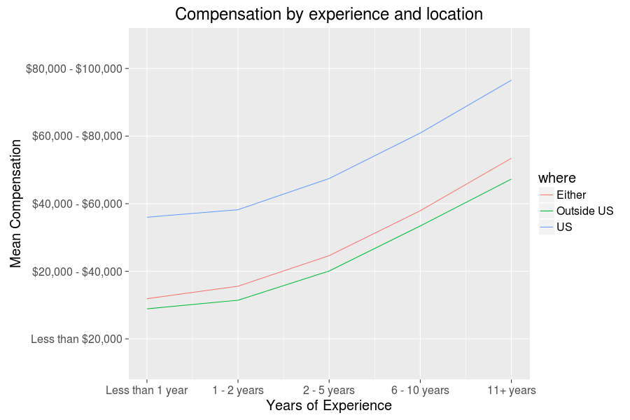
Yep, the world is (at least to some degree and in this context) just. It is also very unequal, though those who like me who have made it to the US can at least feel good about rather cushy average compensations. Besides being in the US, I also happen to be the sort of person to work on these sorts of blog posts in my free time, so a follow up question that makes sense is whether hours spent programming as a hobby also correlates positively with compensation. Perhaps lots of hobbyist programming indicates a more skilled programmer who might get better positions, or perhaps increased compensation translates to less time for hobby programming. Once again, let’s have a look at the data:
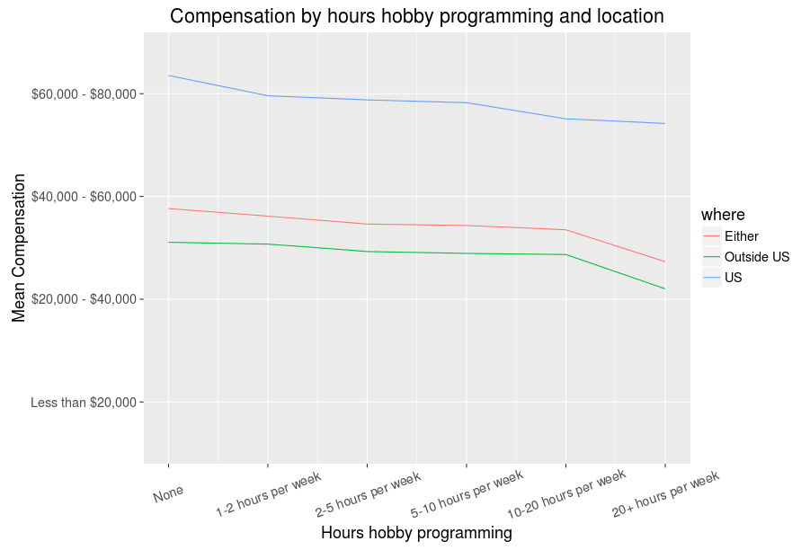
It seems the second is correct - more hours programming for fun does not equate to better compensation, though we can of course be optimistic and hope those with bigger compensations and less hobby programming relish their jobs and are in no need for extra projects. In fact, we can go ahead and look at the job satisfaction data and see:
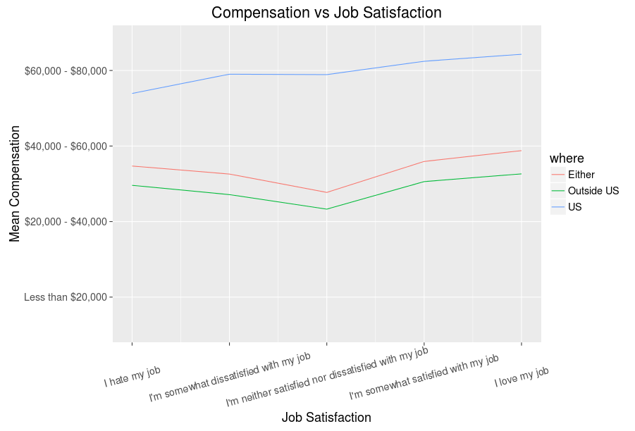
So, seems having a higher paid job does somewhat correlate with having a more satisfying job - all those making big cash are not secretly miserable, good to know. Now then, all these line graphs are fun, but not very efficient, so using R magic we can make a graph that communicates quite a bit more about the variables we have been exploring thus far (click for larger version):
Fancy graphs, right? The fun is just getting started, trust me, the best is yet ahead…
Exploring Countries, Industries, Occupations
Now, the ‘in US’/’not in US’ dichotomy is rather simplistic (and perhaps stereotypically American), so it’d be interesting to see what others countries programmers fare well in:
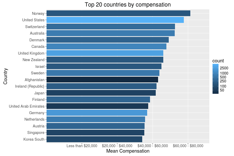
The results, after filtering to require at least twenty observations per country, are as America and Europe heavy as this posts’ likely readership - no surprise there. It is somewhat surprising that high tech countries such as South Korea and Germany are ranked relatively low in the list, though. But, as we said before money is not everything, so let’s go ahead and see how the countries fare by job satisfaction:

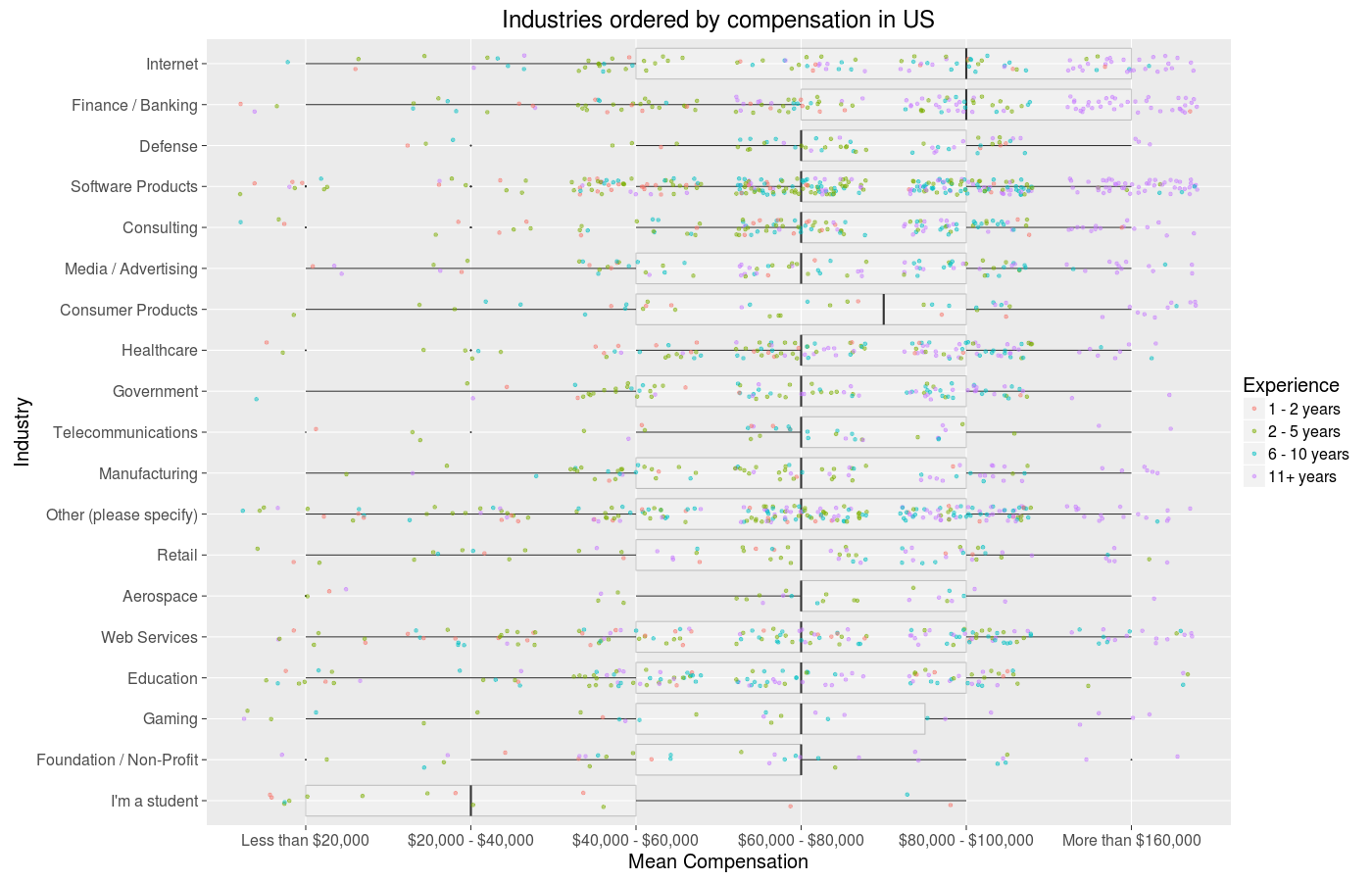
Quite a different result, though seemingly one with less disparity than compensation averages. The US is merely 20th! It looks like Denmark and Israel really hit the sweet spot in terms of balance on both measures. Alas, I live in the US, and that will not change anytime soon. And as a software developer in the US, the next question for me to ask is what industries and occupations correlate with high compensations here:
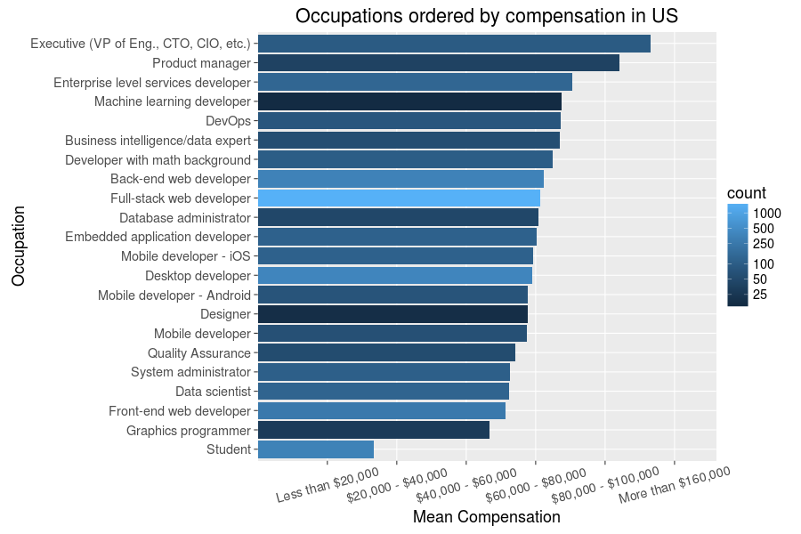
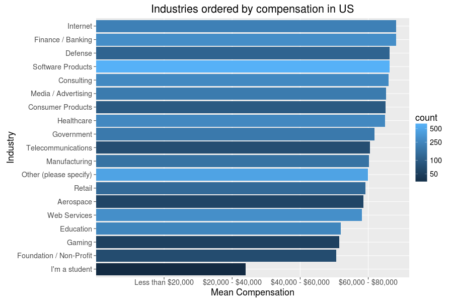
Again, a few unexpected details here - data scientists are apparently not making as much as I thought they might - but most of this seems plausible. Seems it is a good thing I have no particular desire to work in gaming and non-profit industries or as a mobile dev - but then these are just averages, and money is much less important than job fulfillment anyway. So, once again, let’s have a look at that too:
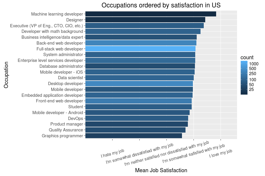

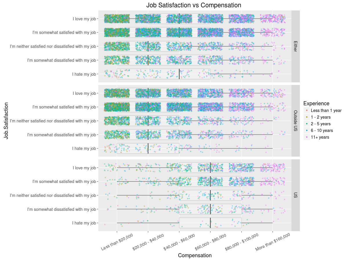
Well, good news for the gaming developer - you may statistically be likely to earn less than most occupations, but also top the charts in terms of job satisfaction. As we saw before, it is possible to display the count and variance of such data fairly nicely with a combination of boxplot and translucent points, so may as well do just that:
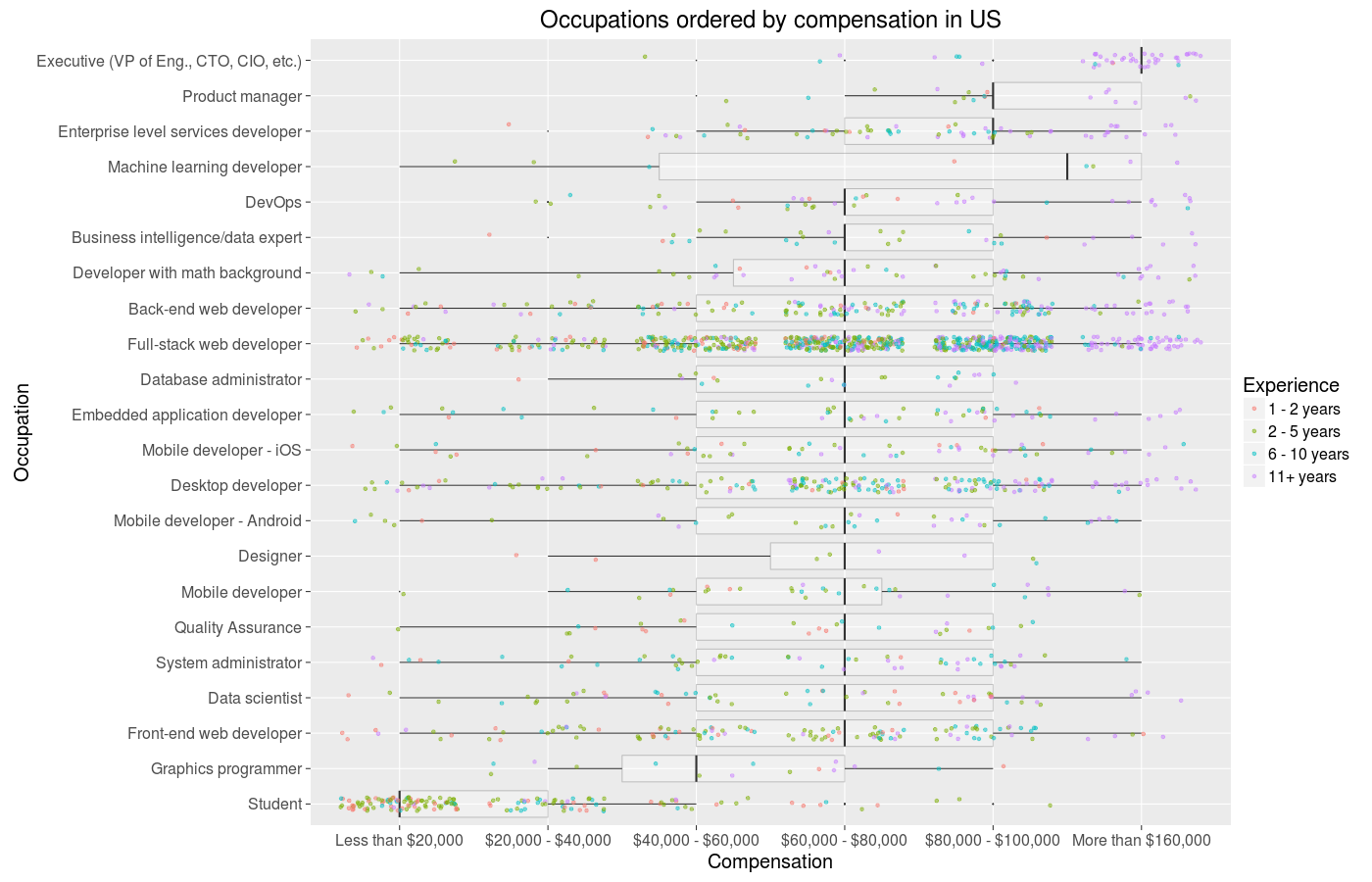
The data is discrete, but R makes it very easy to introduce jitter to be able to roughtly have a sense of the distributions underling the means we’ve been looking at. There is quite a lot going on these graphs, but on the whole I think they do a good job of combining and conveying all involved information. Let’s skip the whole tradition of doing the same for satisfaction, as I am sure you are getting tired of all this satisfaction and money talk and boring bar graphs, and change things up.
Turning Up the Heat
Having played this much with occupations and industries, I naturally started to wonder which industries have the most of each occupation. The only sane way I could envision tackling the question is with heatmaps, and so after several fervent hours of massaging the data and plotting I got this:
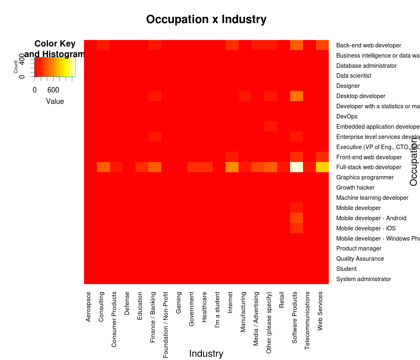
I know, not fun - the full-stack web dev occupation and Software Products industry dwarf all the others in terms of counts and so make most of the heatmap a bland monotonous red. One option is to try to log scale the coloring, but I think that’d be sort of cheating in this case (my mind is built to assume heatmaps are linear), so instead we can produce a heatmap where the coloring is scaled within one row:

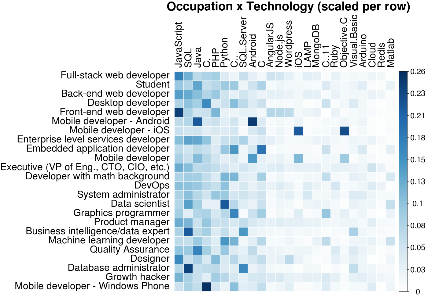
Not bad! The intersection of ‘Student’ and ‘I’m a student’ is bright yellow, so this is at least somewhat correct. There are lots of little neat nuggets of info here, such as the amount of mobile devs and designers in consulting or the prevalence of embedded developers in telecommunications. Admittedly, I produced this heatmap only after another one I knew I would want to make from the start - a heatmap showing the technologies developers in different occupations use:
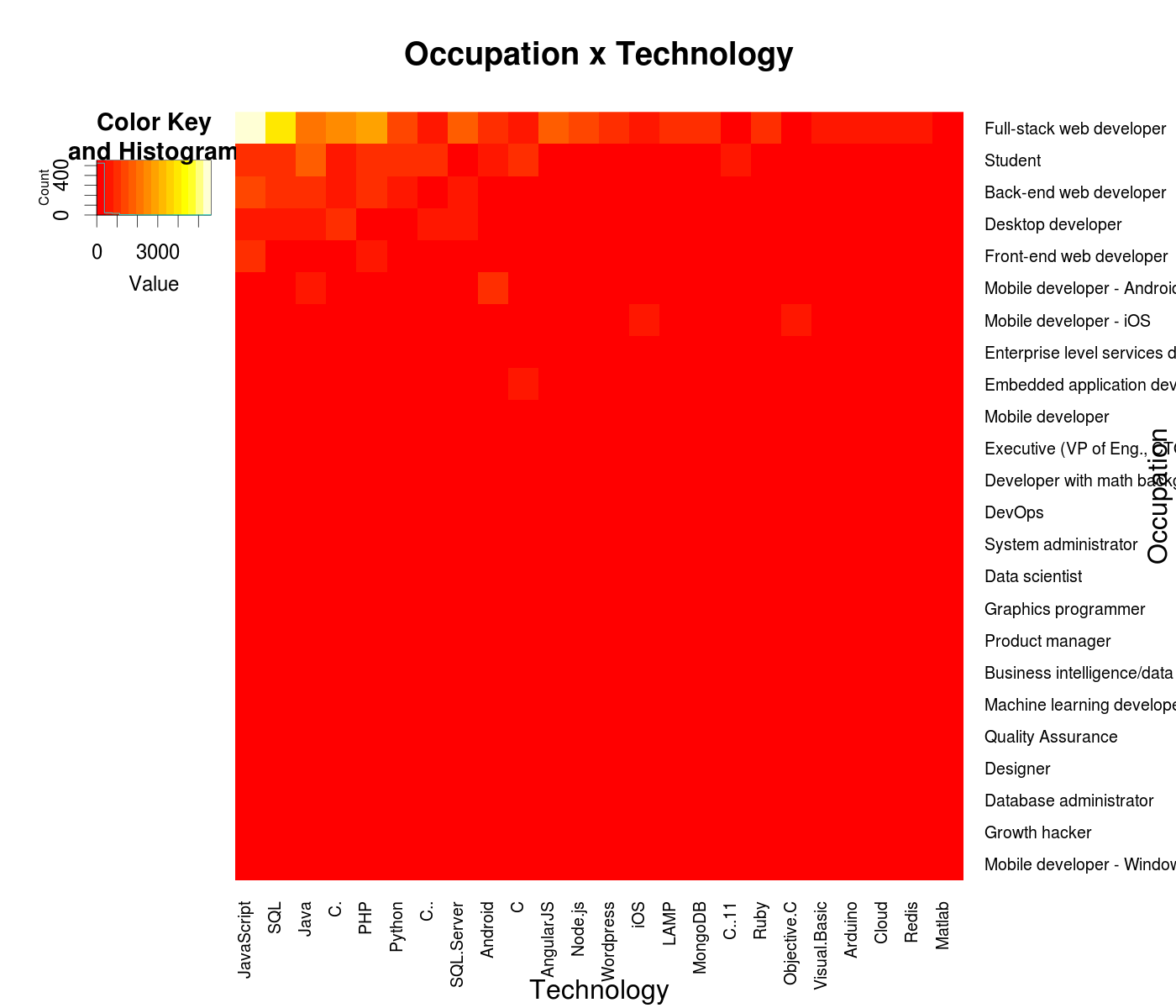
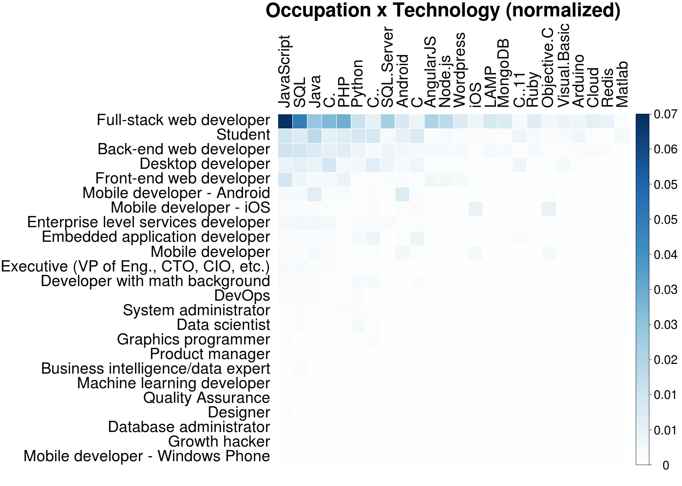
Again with the huge majority of web devs! Well, no matter, we can do the same thing as before and view the data with per-row scaling:

Turns out executives rely mostly on JavaScript and the Cloud, who knew. As these technologies are sorted by overall usage and in fact only the top 20 are shown, I was surprised the niche ones such as LAMP and Redis still have more users than favorites of mine like Django or R. Overall though, this heatmap is nice for simply confirming common sense expectations about technology usage for each occupation. Still, I was not too big a fan of this look, so I also generated the same heatmap with a different:
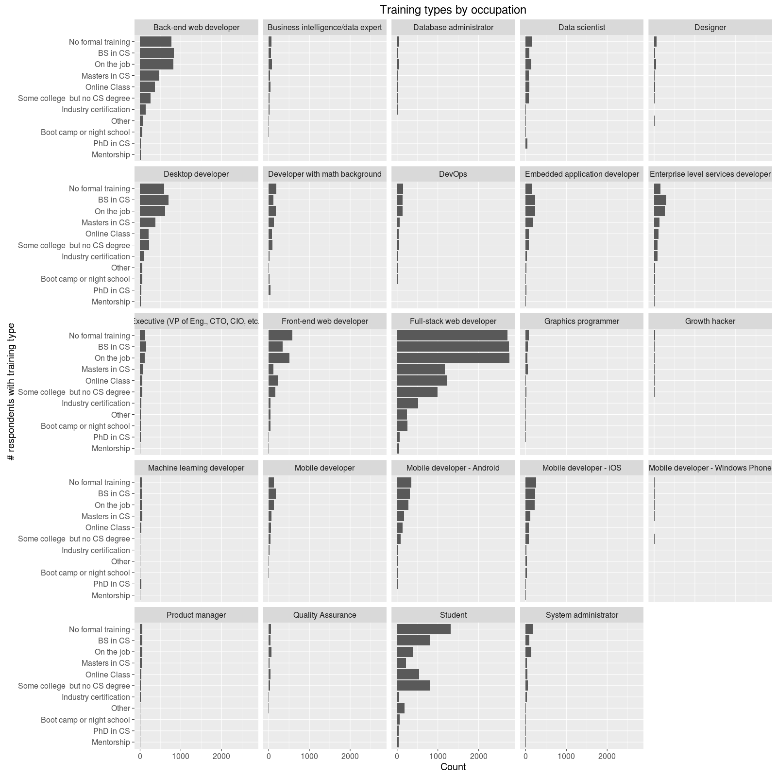
Lastly - How Do You Become A Dev Anyway
Let’s finish up by looking at a topic this post is implicitly really about - how people learn. The survey helpfully asked what sort of training (education, online classes, even mentorships) each responder had. And so, again, we can make use of the information-dense wonder of a heatmap:
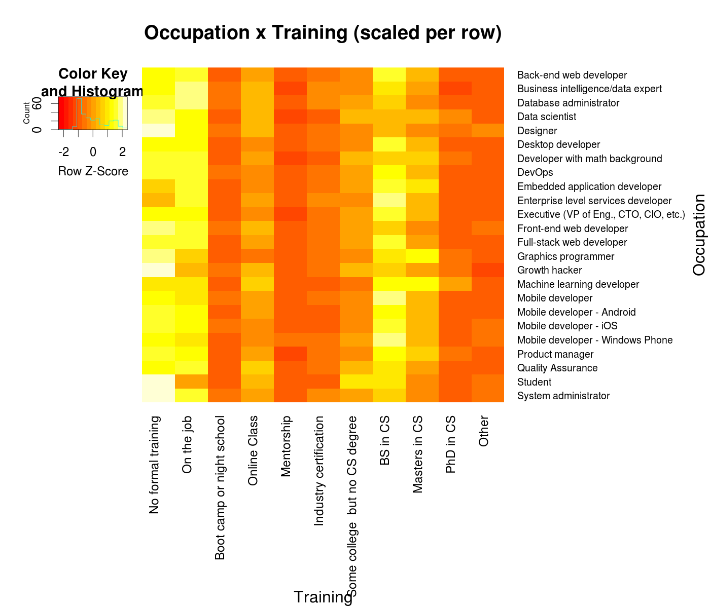
So, most devs get at most a Bachelors degree, learn on the job, or have no formal training at all. However, online classes are also popular, no doubt in addition to these other forms of training. There are also exceptions in the fields of Machine Learning devs and data scientists, which I have some interest in. Just to take a break from all these heatmaps, we can take a closer look at these two with good ol’ bar graphs:
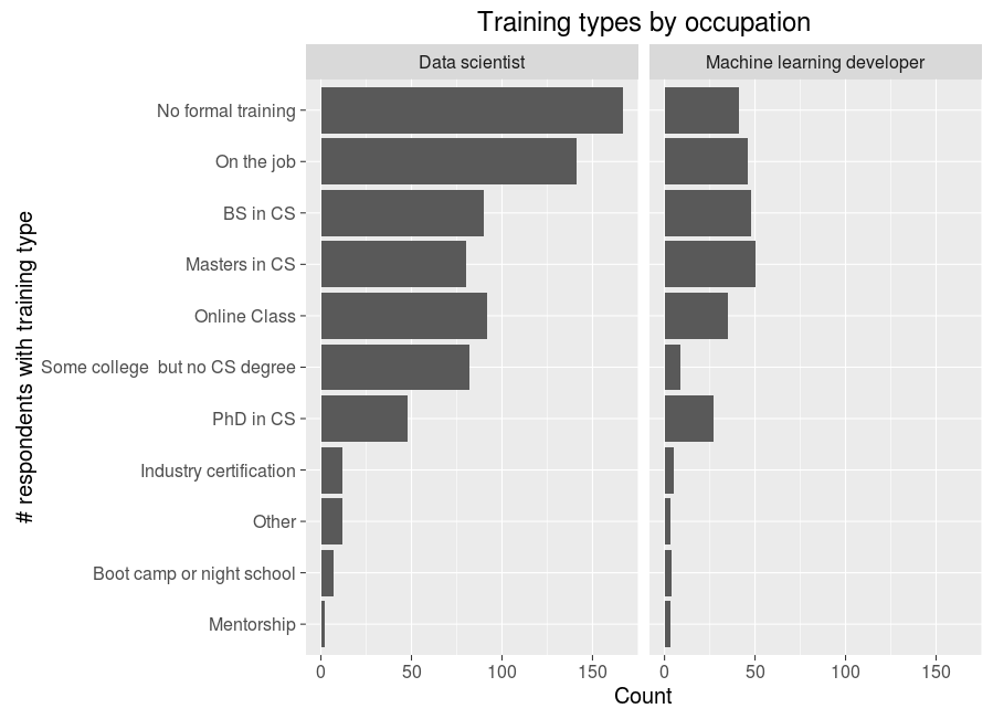
Based on the low average salary of data scientists and the large numbers of them with non-formal or on the job training, I think it is likely the term has just gotten to be used very loosely to encompass many data-oriented positions. Machine learning developers, on the other hand, are still in a more exclusive club of more educated types who no doubt meddle with more math and algorithms. Regardless, the size of both of these occupations (that were not even really around a decade back) is as good a sign of our times as it gets.
It would be tiresome to do this sort of visualization for all the jobs types, but why not go ahead and cap off this spade of visuals with something truly over the top:
Why Do All This?
For fun! But also, for learning. One of the great things about being a person who writes software for fun (and a living) is the lack of barriers to self-teaching new skills - all one needs is a laptop, an internet connection, and large quantities of time and perseverance to go ahead and learn something new. Though in theory just about anything can be self taught with a textbook and time, learning this way can be very difficult if the knowledge is not applied and tested along the way. Computer Science allows for the best of both worlds here in that there are massive amounts of tutorials and information for free online, and using that information requires no breadboards, no tools, no chemicals - just a computer and a mediocre internet connection.
What barriers do exist have been further diminished by the rise of online classes in the vein of those on Udacity and Coursera, which are particularly well suited to teaching software skills - there are now dozens of such classes about algorithms, mobile dev, web dev, machine learning, and so on. Having taken and completed several of these classes I think they can very effectively help with learning through briskly paced lessons and high quality assignments. So, when I found out about the Udacity Data Analyst Nanodegree I was naturally intrigued given my existing fondness for machine learning and lack of experience with data visualization - intrigued enough to sign up for the program (after confirming my company was willing to foot the bill here).
‘Data Analysis with R’ is the fourth class in the program so far, and was my introduction to the language (a sort of mix between Python and SQL, known for being good for data analysis and visualization). The final project for the class called for using the R skills so far for self-led exploration of some data, with the option to choose among a few supplied datasets or find your own - precisely the sort of freeform class assignment I can get excited about. It took me some time to settle on a fun dataset to work with, but when I remembered about the StackOverflow survey data results I became sure there had to be many more opportunities for neat data analysis there - and I’d say I was right!
Previous Post | Next Post
 This work is licensed under a Creative Commons Attribution-ShareAlike 4.0 International License.