
IMDB Data Visualizations with D3 + Dimple.js
A look at how many movies of each genre get released, the IMDB rating distribution, and more! |
Notes: not optimized for mobile (or much else). Full page version here, visualization code here. I don’t get into the technical aspects here, but feel free to take a look.
And there it is! IMDB data1 visualized with D3, or more precisely with the D3-powered Dimple.js. The data is minimally cleaned up by filtering for movies that have at least one vote and associated length information, and info on TV episodes or shows is also not included, but the data is otherwise directly (after parsing) from IMDB. The legend is interactive (try clicking the rectangles!).
As you can see this chart visualizes the number of genre movie releases between 1915 and 20132, as well as the total number of movies in those years. A single movie may be associated with zero, one, or multiple genres and so the ‘Total Movies’ line corresponds to actual movie counts and every colored-in area represents the number of movies tagged with that genre for that year. The clear conclusion is that there has been an explosion in film production from the 90s onward, for which I have some theories3 but no definitive explanation. Beyond the big takeaway there are a multitude of possible smaller conclusions regarding the relative popularity of genres and movies overall, which was really my intent in making such an open-ended visualization.
There is a ton more that can be done with the data. The direction I decided to go with it was to explore various aspects of more recent data rather than more aspects related to change over time. I would love to eventually add controls to view any year range for all the following charts4, but they still reveal some interesting aspects about modern movie production and IMDB metrics.
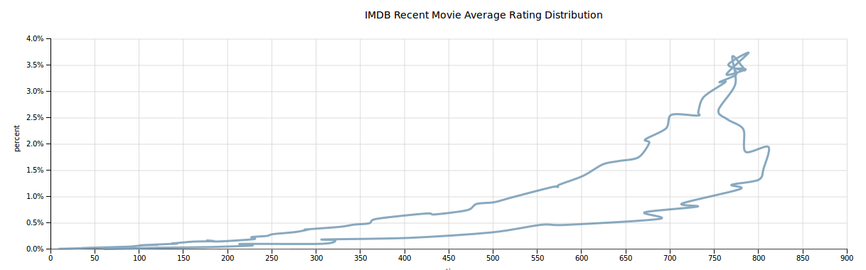
An obvious place to start is with looking at how rating data is distributed, and the answer is delightfully normal:
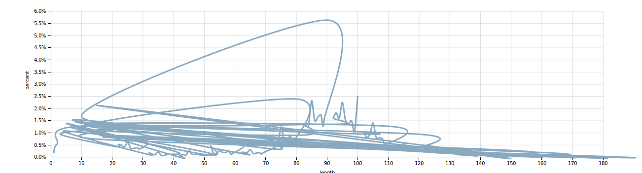
Yep, a bell curve-ish5 kinda shape! Not overly suprising to see that most movies are rated as mediocre/good and the frequency flattens out at either extreme. Next, a slightly more fun shape from the length distribution:
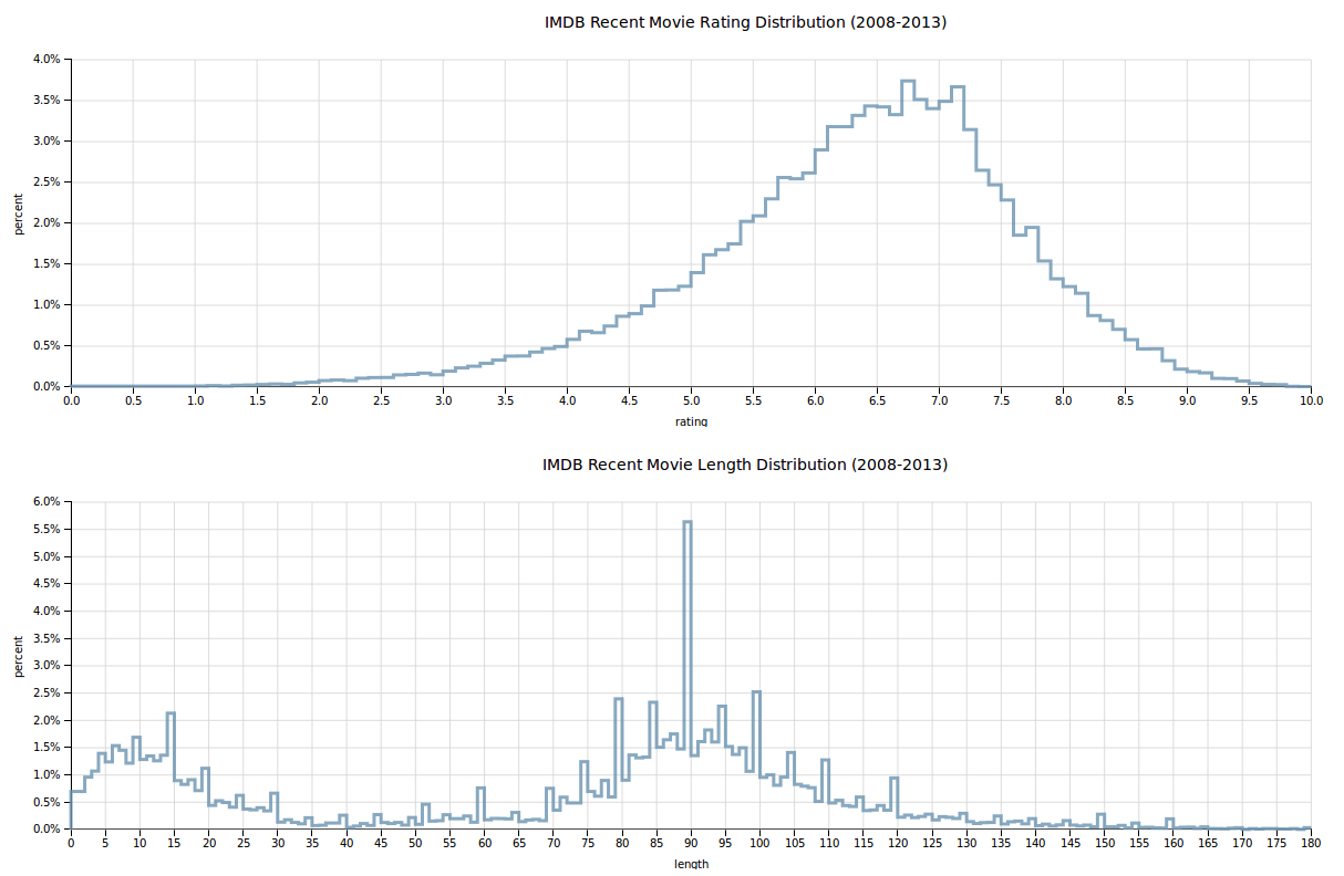
Ah, what a nice regularly spiky shape6. It’s logical that most movies hit the 90-minute mark, though it seems likely that simplified data entry also brings about the periodicity here. The chart is a bit of a mess as a line graph, so it makes sense to clean it up by binning the data quite a bit more:
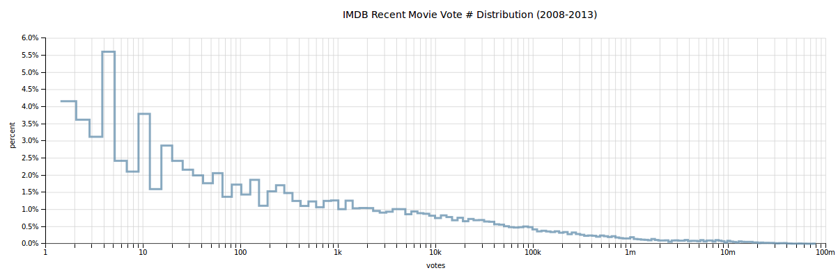
And there it is, hiding in that data was another sort-of bell curve. Except of course for that first bar - IMDB apparently has a large amount of shorter 0-20 minute film entries as well. No doubt short films are part of this, though it’s unclear why there are quite so many. As with many aspects of the data, it could be explored more deeply and filtered more thouroughly to focus on a specific subset of films. But, that’s for another day. For now I continued my visualization quest by looking into the vote distribution:
Yes astute reader7, that is indeed a log-scale on the x axis. Unsurprisingly, the number of votes for any given film declines exponentially - very few of those thousands of movies in the first graph are blockbusters8. As with the histogram above the continuous data is in fact binned for counting, but in this case there are enough bins that it makes sense to smooth out into a line. Once again the data can also be shown via a histogram with fewer bins:
Lastly, I explored the distribution of budgets within the data 9. I was originally inspired to look into movie data based on an article that discussed the death of mid-budget-cinema, and of course I wanted to look into the data and see the phenomenon myself. The result once again demands a log-scale and reveals a certain periodicity:
The data does10 not seem to back the notion of mid-budget movies dying, since one peak is at about 1m, but then again as said before the data is not particularly carefully filtered. There being a ton of less-than one million budget movies certainly explains how such an explosion in movie production might have been possible in the past twenty years. That guess shall hopefully be further explored in future posts, but for now I will finish with a final simplified histogram:
What I Learned
And now time for everyone’s favorite part of the book report. In truth I prepared the genre chart for Udacity’s an online class, Data Visualization with D3.JS. I completed the class as part of Udacity’s Data Analyst Nanodegree, and as with my previous posts based off projects for the nanodegree I felt that I learned11 a useful technology and got the chance to complete a fun project with it worthy of cataloguing. I have a few key takeaways from having now completed the project:
- It’s way easier to do data exploration and visualization via RStudio or IPython than D3. Perhaps this is not true for others, but I was surprised by how high level and unstreamlined D3 is for typical visualization tasks. Of course this is part of its power and the reason that higher-abstraction libraries like Dimple.js got built, but on balance I still felt that using JavaScript, HTML, and a browser was not nearly as elegant as RStudio. As someone only mildly experienced with web-dev, the prior classes on R and Pandas+IPython made me feel much more empowered to play with data easily.
- D3 allows for interactivity, but interactvity is not always needed. This one is rather obvious but why not still spell it out. All but the genre chart here could have comfortably been PNGs files (as in my previous visualization posts), and not lost much. Still, allowing for interactivity does open up a considerable amount of possibilies and in particular is good for open ended data visualization without a single particularly concrete point.
- Aggregation over hundreds of thousands of data points in JS is probably a bad idea. The year-grouped data for the genre graph was originally completely computed in JS when I submitted my project to Udacity. This took painful seconds, which was not helped by my meek laptop. Again unsurprising, but I did feel a tinge of annoyance at realizing I would be best off writing a python script to pre-process my data into multiple CSV files ready for charting without much manipulation.
Bloopers
You did not ask for them, and I delivered. Here are a couple of silly moments during the creation of this12. Hope you enjoyed!
Making small ordering mistakes unsurisingly had major glitchy implications…
… which were worse in some cases than others.
For a while I thought to plot the binned data with tiny little cute bins via step interpolation…
… but evidently changed my mind.
Notes
-
The cutoff years are chosen due to there being very few movies comparable to modern films prior to 1915, and the data possibly being incomplete post 2013 ↩
-
Primarily that films are cheaper to make due to digital technology and that IMDB tacks more modern movies better ↩
-
This is nontrivial for various boring reasons and I have too many side-projects as it is… ↩
-
Fine, a somewhat offset and wobbly bell curve, but still looks pretty good. ↩
-
Don’t you just want to take the fourier transform of it? ↩
-
Too corny? I shan’t apologize, this is my site! ↩
-
Again, something warranting a deeper dive someday. ↩
-
Many movies did not have associated budget data, but that still left thousands that did ↩
-
I know, ‘do’ is grammatically correct here, but then natural speech is largely nonsensical so who cares ↩
-
Well, learned a little… ↩
-
Wow, did you actually read all the text and are still reading it? High five. ↩
Previous Post | Next Post
 This work is licensed under a Creative Commons Attribution-ShareAlike 4.0 International License.